Showing posts with label Pastel painting. Show all posts

Thursday, November 3, 2011

Final painting

Here is my final version of latest painting from last post...

I did a few more small, but important, details on the woman and background area.

Waiting and looking at piece towards the end - I think - is more significant than just finishing it to get it done.  In this case, stepping away really allowed me to "see" what few details were needed.


Thursday, October 20, 2011

Pastel painting in stages


Here's one of my recent pastel paintings in stages.

First I use a reddish pastel surface to work on.

 ... since the Cenote Azul photo has a bright green.

Beginnings are always rough.


In this one, I have added more layers of color...


This stage you can see my bold swipes across pastel surface with different parts of my hand...

More layered color, final details & hits of color... Is it finished??

Or should it be a square?

Friday, February 25, 2011

Painting water & people bring up good memories

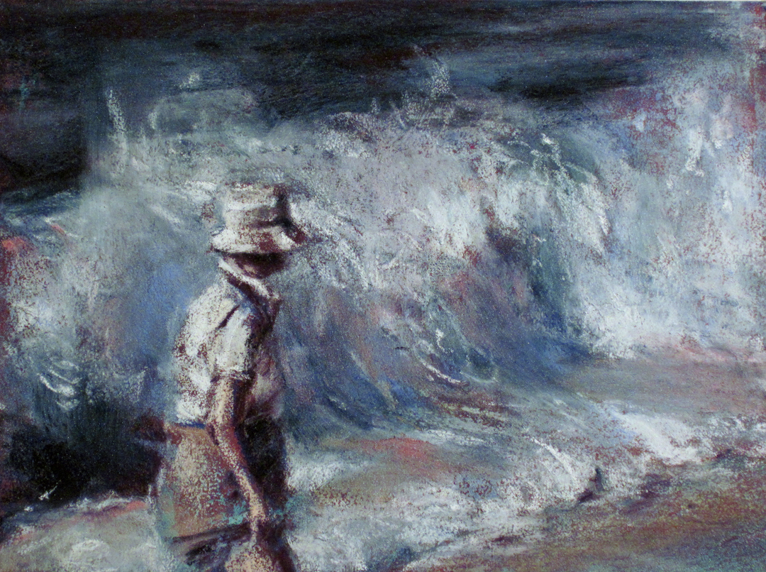
Painting water and people bring up good memories.  This is a new painting... someone gave me a photo of their grandmother at the beach.

Since I also spent many hours at the South Carolina beaches growing up... also many of those times with my own grandmother... it ended up being quite a fun piece.

I have not painted the ocean in many years, but honestly really enjoyed the freedom.

So, here it is in a few stages:  The top one is detail of almost completed painting.  (I might add a touch of something else...)


(This is almost final stage... notice the shoulder is fixed and I brought out light in hand, neck and some other colors in water...)


                          (Earlier "roughed in" stage... getting motion, light/dark)


(This is a 12x9" Richeson Premium Pastel Board-originally reddish color-that had a previous pastel on it.  I rinsed off most of the previous painting... but had some cool 'ghost' markings remain-like the turquoise in her shorts.  I used mostly Unison Soft Pastels, but added a little Sennelier metallic soft pastel too!)


Thursday, October 14, 2010

Finished.


Here it is... finished. This is the painting-pastel and acrylic on pastel board-I created for the Mint Museum Uptown opening.

(The other one didn't make the cut.)

It's 20x16"... very atypical for me and I love it!

Friday, October 1, 2010

Next stage...

Here they are closer to the end... the orientation has changed, I added more pastel and will paint with metallic acrylics (with some pumice) a bit more over this stage... then hopefully, the finishing touches in pastel tomorrow.


Sometimes you have to finish work for deadlines. This is no surprise for an artist.

But this experience has been so interesting because of the very atypical painting style and subject for me. However, this diptych, inspired by the Mint Museum Uptown collections is really born out of my summer residency at McColl Center for Visual Art.

I was an Affiliate Artist there for from mid-April to mid-August (2010). I had an amazing studio and was able to pursue some bodies of work and do some media exploration that just wasn't happening for different reasons in my home studio!

I will post pics of the final paintings and if you're in the Charlotte, NC area, I hope you'll be joining in the Mint Museum Uptown Grand Opening this weekend. It officially starts at 5PM and runs 24 hours straight... ushering in a new season for my favorite city in the South!

Monday, September 27, 2010

Mint Museum Uptown work... IN PROCESS

Following are three stages of my new diptych (20x16" each) inspired by the art collection of the soon to open Mint Museum Uptown:


1a) Above is a pastel board painted with acrylic, and then a little light & dark pastel added. Finally, water and acrylic washes are painted, sprayed and slung across surface.


1b) Above is the pastel on newsprint sketch of next abstract layer of marks. I was practicing what I wanted to do before doing it on final painting.


1c) Above are steps a & b combined. Not sure where I am going next. (Also notice I changed orientation.)


2a) Above is the second pastel board painted with acrylic, and then a little light & dark pastel added. Finally, water and acrylic washes are painted, sprayed and slung across surface.


2b) Above is the second panel's pastel on newsprint sketch of next abstract layer of marks. I was practicing what I wanted to do before doing it on final painting.


1c) Above are steps a & b combined on the second panel. Not sure where I am going next. (Also notice I changed orientation.)

Friday, September 17, 2010

Mint Museum Uptown-inspired diptych (In process)

[I don't post but once a month for quite awhile and then three in one
day!]

Anyway... here is where my basic composition is coming from... for my Mint Museum Uptown inspired diptych painting. (Diptych means two panels... in this case two 16x20" pastel boards.)

Below is an in-process pastel painting, standing alone as a work in itself, from the photo of my model with tulle. The composition for Mint Museum Uptown inspired diptych painting is derived from this. But, I am hoping it to be more abstract.


Below is a-bad-picture of my rough compositional sketches for diptych panels. I will post more as it evolves... as well as invite you, if you're in the Charlotte, NC area on October 2, 2010, to stop by and see my paintings in person. It is FREE. (And, of course, see the AMAZING new Mint Museum Uptown:-)


Mint Museum Uptown Grand Opening in Charlotte, NC

I am very excited to be creating a diptych painting inspired by the NEW Mint Museum Uptown! I will finish it during the Grand Opening weekend, working on it Saturday, October 2nd from 10AM to Noon in the 2-D studio. I do hope you'll mark your calendars for this momentous event in the history of Charlotte, North Carolina!!

Saturday's events are FREE! (BUT, it will be a crazy busy uptown with both the Grand Opening and Race for the Cure going on at the same time:-o) Here is a link to find out DETAILS... www.mintmuseum.org/grand-opening

After accepting this invitation to create a new piece of work inspired by the new Mint Museum Uptown, I was treated to a private preview of most work installed up to that point. The Danny Lane commission was almost complete and WOW is it incredible.

I also saw their American Art Collection literally in a new light... they have conserved ALL these paintings and many look like new works, with their details and colors exposed!

SO... following is a peek into my process... I'll write some brief explanations and will post more later.

I am inspired by Chuck Close, Julie Heffernan, Romare Bearden, Eric Fischl and Danny Lane among many others in the New Mint Museum Uptown collection! For the grand opening celebration, I am painting a diptych inspired by these artists, compositionally based on a photo of a woman and fabric in water (seen at the top area of this photo below... along with a smaller pastel painting of this image).


1) Above you see my pencil sketches from the original paintings in the Mint Museum Uptown Collections... and one 16x20" painted pastel board underneath.


2) Here (above) you can see my process... acrylic paints in palette (with pencil sketches from actual works of art in the collection and dark pastel board).


3) Above you can see my process of first painting layers of acrylic metallic washes that will peek through the final pastel layers. (I will then hand brush a layer of clear pastel medium over to give surface some "tooth" to hold soft pastel.)


4) Above is a detail of an experiment with Hosho paper & acrylic paint. Underneath is a glazed pastel board.

5) The two final photos are also details of experimentations with various acrylic washes and metallic paints on this same Hosho paper. (I was thinking I would collage some of these-Bearden style-to the pastel board.... then, cover them with pastel medium and add pastel on top, BUT the thin paper did not collage too well.)



Tuesday, January 5, 2010

Another one completed...


"Below" (12x16", soft pastel on board) is my newest pastel painting completed. I really like working on the textured pastel surface. (See previous blog entries for in process shots... including the original textured surface.)

Sunday, January 3, 2010

"An underwater composition"


"An underwater composition"... here it is finished.


... a detail.

Wednesday, December 9, 2009

On the easel.


This in process pastel is the current one on my easel. It's also a great illustration of the last blog entry, "the angle makes the proportion." Notice how her left arm is folded... in order to show the weight of that shoulder, I must accurately show the angle those edges create. (This might not make sense to some folks... verbal VS visual explanations. But, I have to try.)

Now some other areas are rather unresolved, like the hands, right shoulder and breast area... but that is what "in process" means!

Wednesday, November 25, 2009

Pastels by color and value


Although I have seen many professional pastelists order their pastels by color and value, I haven't done this to all of mine in a long time... until recently. Partly because I teach and do plein air with my pastels (and use different color palettes depending on what I'm painting) and also because of the number of boxes I have, it seemed to be a hassle to order ALL of my soft pastels by their color and value.

But, I realized it was hurting my work. It was difficult to "see" the colors and values of yellow, say, when some were together and some were mixed with other colors! So, now that I have done this, it's been great for my current paintings AND I realized I had some duplicate colors that went into my teaching or plein air box.

It also made for some cool photos! If you compare these pics to my October 13 post photo, you can see what I meant about colors being mixed up.


[At the top is a photo of some of my Unison Soft Pastels. Directly above is my box of Richeson Soft Pastels. Both are hand-made. Unison are best quality and my all time favorite pastel... ever! The Richeson are good because they are big and bright & affordable... but I can't layer as much as with the Unison.]

Monday, November 23, 2009

Almost done.


"Below", pastel on board, is my most recent pastel painting. It's shown here above almost completed. The texture is rougher than many of mine usually are. I used a tinted Colourfix primer that I painted on top of a GatorFoam board. Therefore I got a more random texture from the brush application. (A number of pastelists paint their own textured surfaces, including Susan Ogilvie.) I especially like the way the color drags across the texture on the surface of the pool... really mimics the light moving across wall & floor.

This is the second painting in which I've used lots of bold red. Since I have been painting this series of women in pools for so long, I do get bored from time to time and have to shake it up, so to speak.

I also approached this a little differently after watching a Susan Ogilvie presentation earlier this month. She has a very methodical, strong approach to her pastel painting. She uses bold marks with subtle color variations to add interest. I don't think anyone would think of her work when looking at this painting, but her influence is there nonetheless. (It is a great idea to see other artists work... can really be inspiring... not to copy them, but to learn from their approach!)

Thursday, November 12, 2009

The evolution of a pastel painting.

This is what I have been up to... in between sharing my marketing & strategic planning ideas with other artists and getting inspired seeing Susan Ogilvie start a pastel yesterday [www.susanogilvie.com]. I was volunteering during her workshop hosted by Piedmont Pastel Society [www.piedmontpastelsociety.org]... of which I'm a member.

So, anyway... here is the evolution of my latest pastel painting... not quite done yet. (The color is a little off because these are "in process studio shots" under different lighting.)


Stay tuned for the final image... as well as more in process studio shots of other work.

(PS... I just delivered two new paintings, including "Yin" below, to RedSky Gallery [www.redskygallery.com]:-)

Sunday, October 18, 2009

YouTube Introduction to Soft Pastels

Here's the YouTube link to my introduction to soft pastels... (It's from my Instructional DVD, "Painting Water with Pastels".)

www.youtube.com

IF you like what you see, my DVD is available through Cheap Joe's Art Stuff for $24.99. Here's the link for that as well...

www.cheapjoes.com

Tuesday, October 13, 2009

What pastel supplies do I use?

What supplies do I use? I have been pastel painting for over a decade and have tried many products. Like everything, quality does matter. As an artist, we should use the best quality products we can afford. You can see some of my own pastels to the left.

For me, the best out there is Unison Soft Pastels (www.unisoncolour.co.uk/). They are hand made in England, distributed in the US by Jack Richeson & Co (www.richesonart.com)... and can be purchased at various art supply companies. But I prefer to buy from my favorite local (North Carolina) business, Cheap Joe's Art Stuff (www.cheapjoes.com).

Because the pastels are hand rolled, they are wider in the middle and thinner at ends. Extruded pastels, like Rembrandt, are all the same width and also have a coating on surface that should be rubbed off before using. Even if you cannot afford to move to Unison Pastels, consider buying a couple of darks and lights in this brand to supplement your extruded pastels. Your paintings will be better.

As far as surfaces I work on, I use professional pastel products that have a toothy surface. They hold the pastel and I don't need fix in the end. My two favorite products are Jack Richeson & Co. Premium Pastel surfaces and Colourfix Pastel boards (www.artspectrum.com). The JR&C boards have a LOT of tooth and can take lots of pastels... and their gator foam boards can be washed off if you have a dud painting. The Colourfix boards are great for plein air and have more colors to choose from.

For more on all of this, use the links, or better yet... get my DVD, "Painting Water with Pastels" (www.cheapjoes.com).

Monday, October 5, 2009

A peek in my studio...

I have just delivered nine new pastel paintings-including the three paintings you see just started with original photos to the left-to Red Sky Gallery in Charlotte, NC. (www.redskygallery.com)


To left is one of these 7x5" gems, And around again, finished. See my website, www.carmellajarvi.com, for more info about this work and Red Sky Gallery reception.


Here's a photo of my new pastel studio space... I still have another smaller painting, etc. studio, but here, I can leave my pastel work & supplies out. You can see several paintings in process on the easel... as well as my soft pastels set up. One of my favorite things about Vermont Studio Center (where I was a painting resident in 2006 & 2008) is having lots of different artwork going on at the same time! (www.vermontstudiocenter.org)

Sunday, September 20, 2009

Two new paintings

These are two recent pastel paintings that I am so happy with. (You can see this new work starting October 9, at Red Sky Gallery, Charlotte, NC... their East Boulevard location... www.redskygallery.com)

Many things have converged this summer for my new body of 'figures in water'. First, a new permanent pastel studio space in addition to my existing studio means I can always have my pastel paintings going... and I have! I enjoy painting with oil, but pastels are my passion... my expressive medium!

This summer, I bought an underwater digital camera which really opened up the images I could capture in water... because I can SEE what I just shot! (This also helped to show the model what I like and am looking for.) Thankfully, I had access to a couple of different pools and models, including one place where I could do live figure study of the model next to or inside the pool! (Painting real water and real person helps me when I go back to the studio and work from photos.)

I'm varying my sizes, working with different color palettes and painting almost every day. This last part is tough because of all the other things I juggle. Anyone self employed knows it IS more difficult to get to work when you're working from home... many, many distractions. BUT, moving my permanent pastel studio space to another building has been great because I am leaving the house!

Do what you want with all this... I just wanted to share my thoughts on this cool body of work being the convergence of many things. (See more on www.carmellajarvi.com.)

Monday, September 14, 2009

I love the business of art!

What a great week... In my pastel studio the first part and this past Thursday, I was in Penland for a Creative Capital Professional Development workshop. (It was a refresher course for me and a chance to see the presenters.)

Even though I teach marketing and strategic planning to others, I still need professional development and inspiration from time to time. There are some things I'm doing well or have improved... but then I have my weak areas too! (And, I like to be around artists that are positive and excited about possibilities!)

You may not love the business end of art, but you should spend some of your time/energy learning about it. A business will improve with intention. (This is the idea behind writing goals and steps to achieve those goals. When you focus on something specific, you see things differently... look at opportunities in a new way.)

Another great aspect of my Penland trip was staying at the Celo Inn (www.celoinn.com/rates.html). It's about 30 minutes from Penland and is very affordable with a tasty breakfast and it's a beautiful Inn & location!! (Of course there are many cool places to stay & things to see in the Mountains!)

Tuesday, September 8, 2009

First stage of a pastel painting

This is the beginning of one of my newest pastel paintings. Tonight I almost finished it (so it looks more colorful, detailed and smooth... will post pics as soon as I share new work with Red Sky Gallery).

One day, I'll do a series of these really rough, sketchy impressions of a moment in water. There is something lovely and raw about the marks capturing that suspended moment of light & movement... body & water. But, finishing a painting and pushing color into color... thick and rich is cool too.

Being dedicated to my own art is why I quit my full time teaching job three years ago. I think this is the first fall I was totally absent of that 'back to school' feeling... finally deprogrammed from 13 years of teaching and how many years was I a student before that?? This fall is about painting in my new pastel studio space and enjoying September... with it's crisp nights.....

Followers